
Petite Eats Rebrand
A Fresh New Look
As the designer behind Petite Eats, I wanted to refresh the brand to reflect its evolving identity while maintaining its playful and approachable vibe. The original logo served its purpose well but felt too minimalistic for the vibrant energy and creativity the brand now embodies. My inspiration for the redesign came from the colorful world of bite-sized desserts, where fun meets flavor. The new logo brings a pop of color and charm, perfectly capturing the sweet essence of Petite Eats. This project allowed me to showcase my ability to take a brand’s identity to the next level, marrying visual design with personality and purpose.

The original Petite Eats logo was inspired by elegance and simplicity, as I started out doing corporate events. But as the brand grew—and with exciting new ventures like my cookbook and online cookie shop on the horizon—I wanted the logo better to reflect my personality and the fun side of baking.

Original Logo

Stickers

Branded Materials

Business Cards

Social Media Content
For the redesign, I kept the charm but brought in bright pink, playful fonts, and icons like a piping bag and cupcake. The result is a logo that feels vibrant, fresh, and more aligned with who I am and where Petite Eats is headed.

Redesigned Logo

Branding Mockup

Sticker Mockup

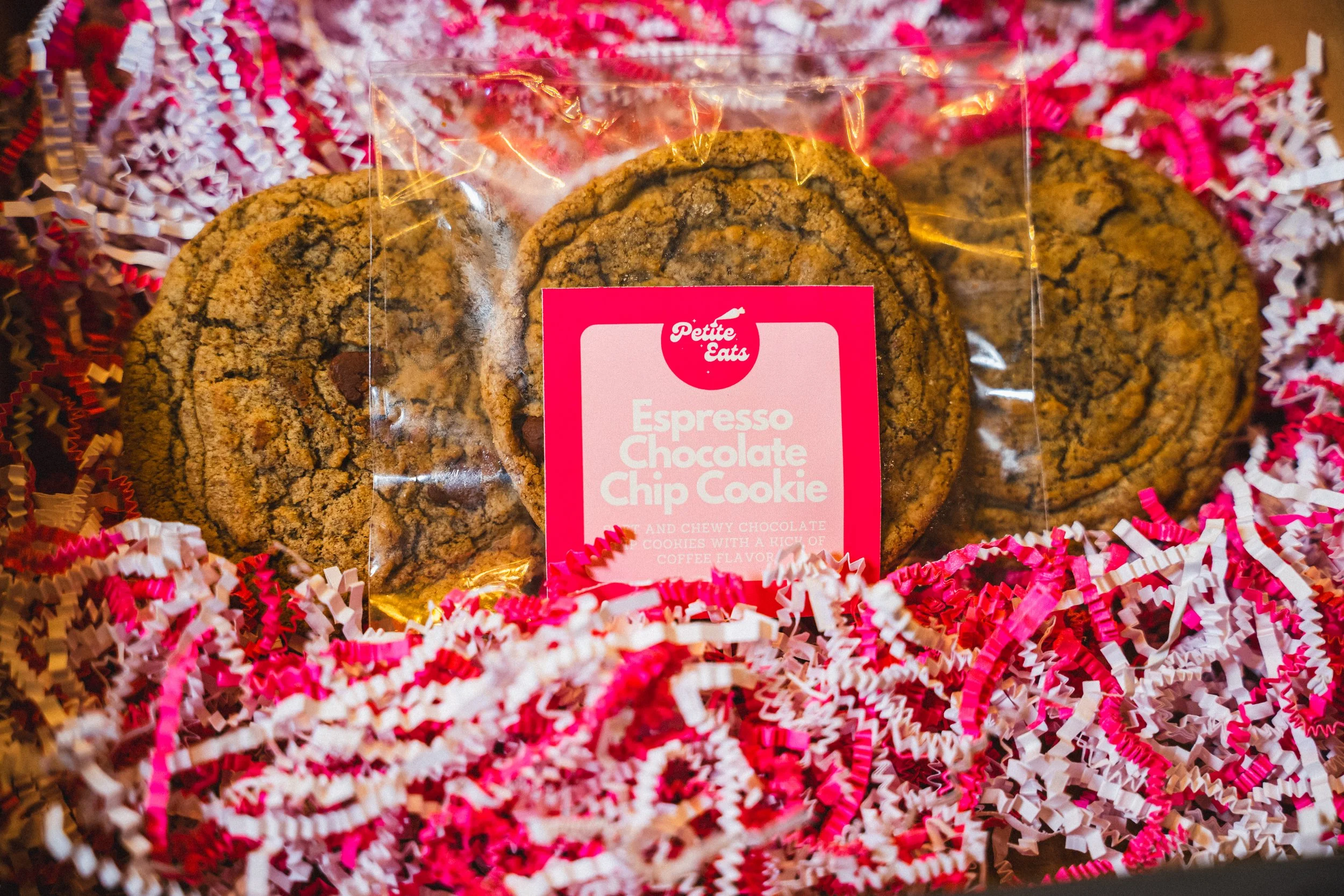
Cookie Label Design

Thank You Note Design

Thank You Note
Social Media Content
